CURRENT USERS:
Butterfinger appeals to a wide range of ages: kids, teens, young adults, and adults. The majority of the users are those who like the contrast of crispy and crunchy textures combined with peanut butter.
CULTURE AND ENVIRONMENT:
It is known for its distinctive crispety, crunchety, peanut buttery flavor and their tagline is "Nobody better lay a finger on my Butterfinger!" which identifies the brand in ad campaigns.
REBRAND GOAL:
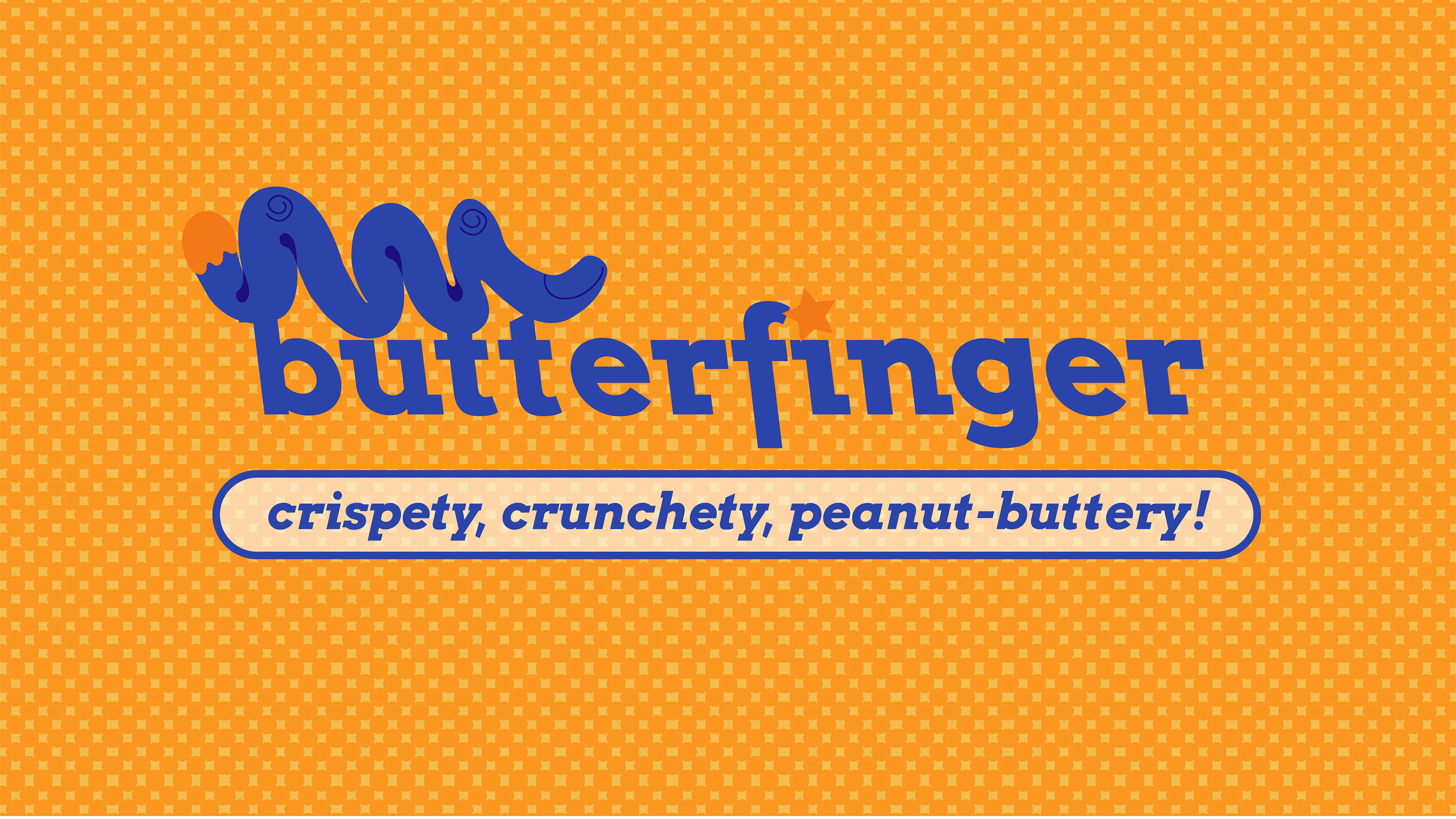
The rebrand I aimed for is for a more humorous, whimsical, and youthful appeal. Rather than sticking with the old-fashioned palette, using a deeper set of colors from the original will gain more attention from the younger audiences.
The rebrand I aimed for is for a more humorous, whimsical, and youthful appeal. Rather than sticking with the old-fashioned palette, using a deeper set of colors from the original will gain more attention from the younger audiences.

For the logo, I created the imagery of a squiggly finger that’s dipped in peanut butter, however, the shape can also be identified as a corkscrew and caterpillar. It suggests the feeling of wanting to dip your fingers into the butter of Butterfinger. In a crowded confectionery market, a distinct and playful persona can set Butterfinger apart, attracting attention and fostering brand loyalty.
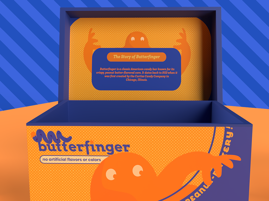
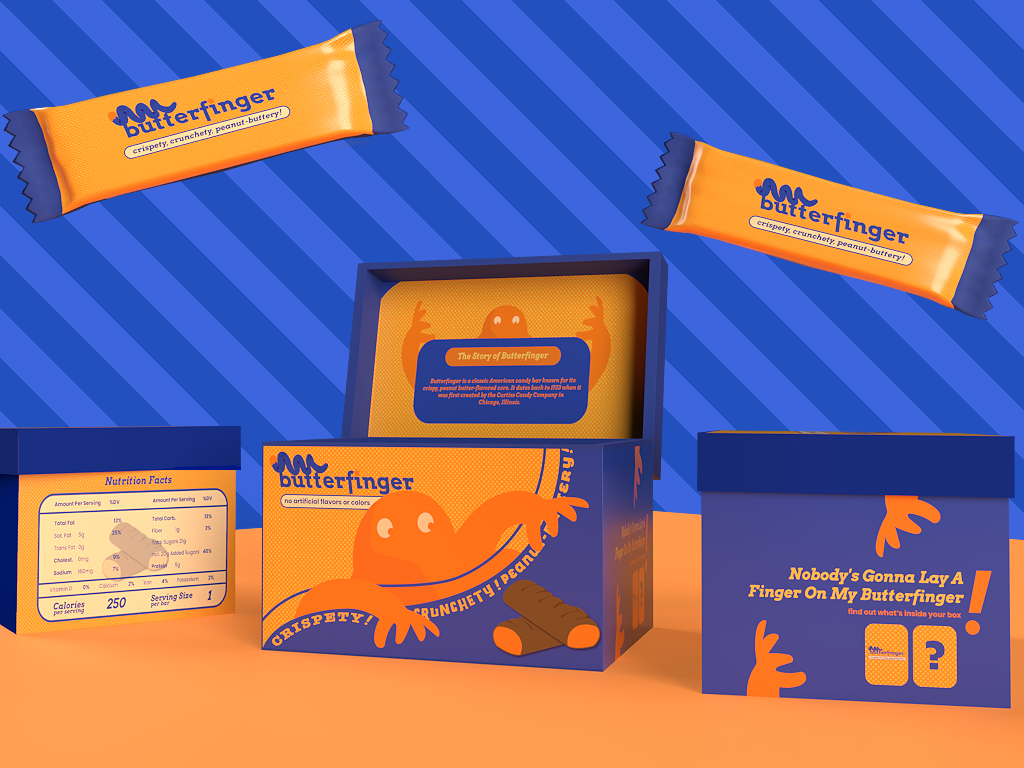
The packaging I designed for Butterfinger extends the brand because we included the element of storytelling using a mascot. Butterfinger currently doesn’t have a mascot so we designed a playful mascot that can improve brand recognition. Using the familiar colors of orange and yellow, we created a glob-butter monster.


The colors orange and yellow turn into a visual cue that aids in Butterfinger's recall for customers, improving brand recognition and retention. The packaging portrays a playful mascot reaching for Butterfinger bars, telling a gripping tale and evoking strong feelings in viewers. This narrative encourages interaction and gives the brand more depth.
By including trading cards, the brand is extended beyond the tangible good and becomes part of a more comprehensive brand experience. An interactive element is also added by introducing trading cards that feature various Butterfinger editions and flavors. Customers are encouraged to gather and distribute, making the act of buying a memorable and joyful one.


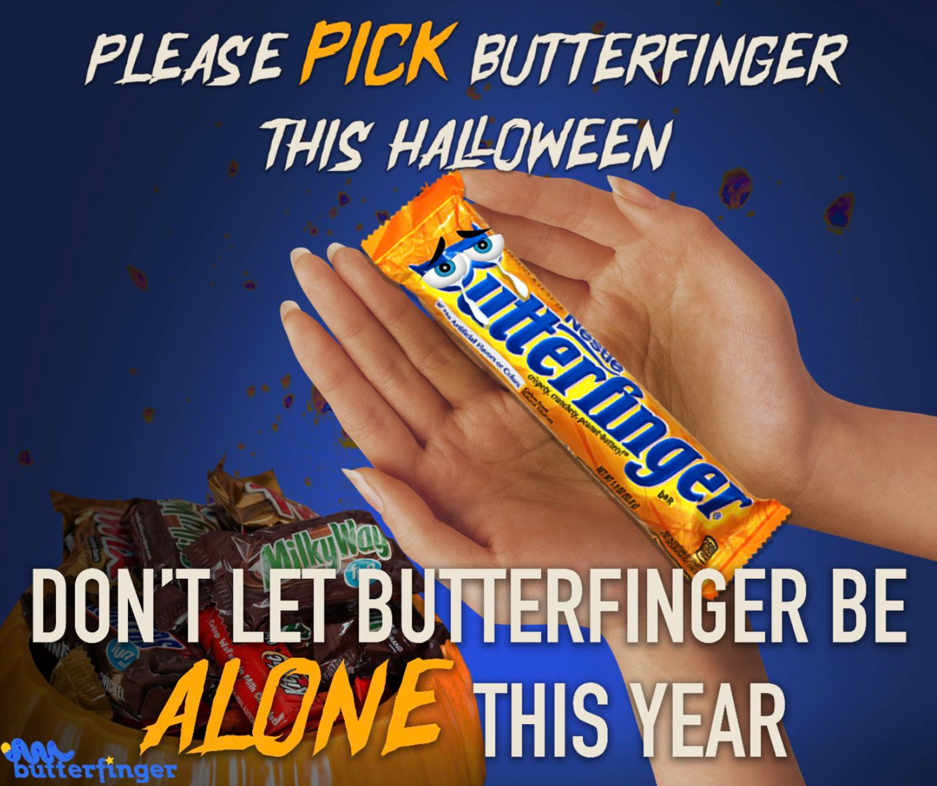
The Butterfinger ad I designed extends the whimsical and humorous nature of the brand with the Halloween-themed ad campaigns. Promoting the brand during Halloween will also reach out to the younger generation who doesn’t want Butterfinger as their top choice. With that stated, I wanted to create the imagery of how lonely Butterfinger is compared to the rest of the chocolate bars on Halloween.
CONCLUSION:
In conclusion, Butterfinger should consider transitioning to a wacky, whimsical, and humorous brand strategy in order to engage with their consumers, differentiate themselves in the market, and create positive associations with their brand. Also, going for a more lighthearted image can revitalize Butterfinger's brand, appealing to a broader audience and staying relevant in the competitive market.

